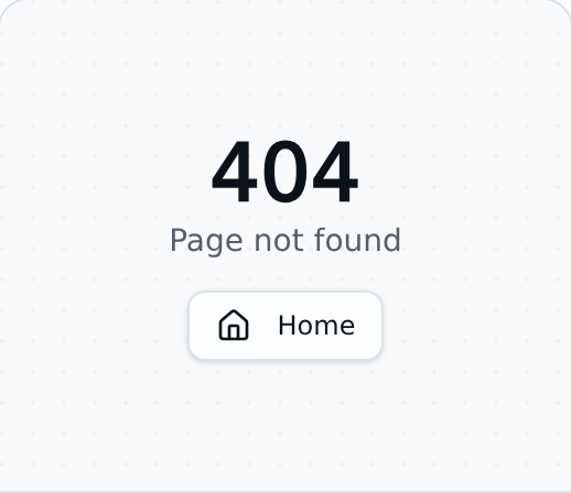
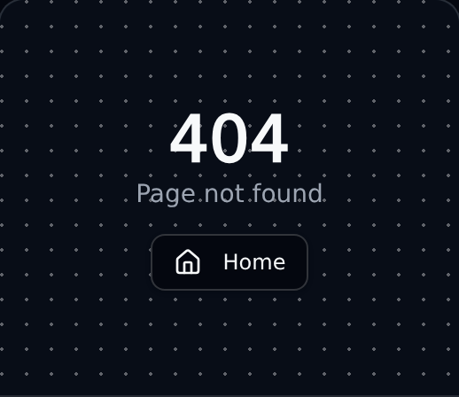
404 Block
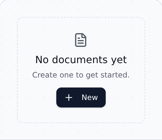
FeedbackNot-found 404 state with a clear message and a primary link back to the home page or main content.
A clean, accessible catalog
Browse primitives and composed patterns - sorted alphabetically, by UI category, or by the workflow they support. Designed to meet WCAG 2.2 AA.
69 components
Not-found 404 state with a clear message and a primary link back to the home page or main content.
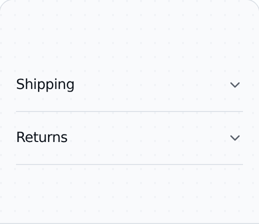
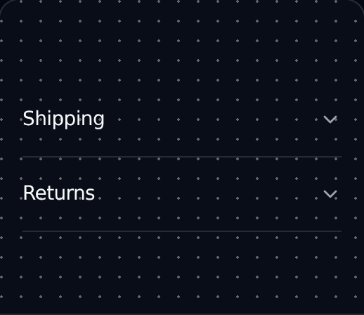
Vertically stacked, collapsible content panels for grouping disclosable sections of related information.
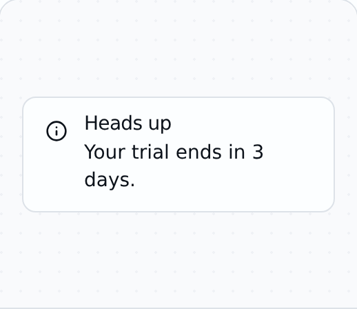
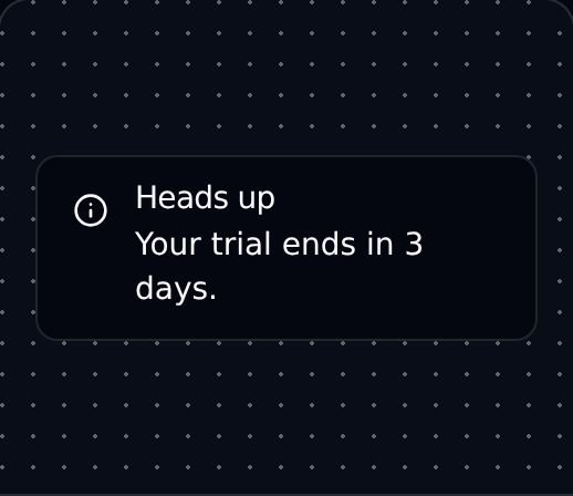
Callout box for highlighting important status, warnings, or contextual information inline with content.
Modal that interrupts the user to confirm an action.
Theme toggle that switches between light and dark color modes while respecting system preferences.
Constrains embedded media or content to a specific width-to-height aspect ratio across viewports.
Circular user avatar with image, initials fallback, and graceful loading when the image is unavailable.
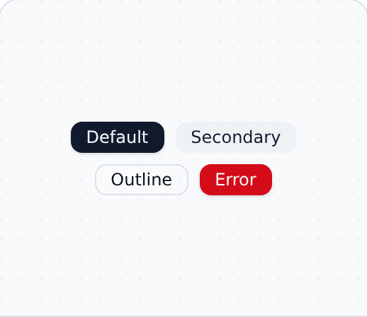
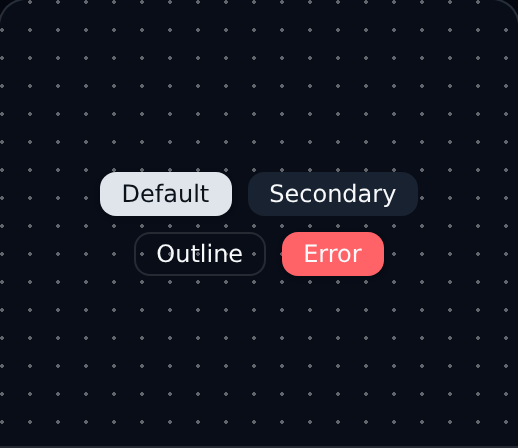
Small status or category descriptor used to label, tag, or annotate UI elements at a glance.
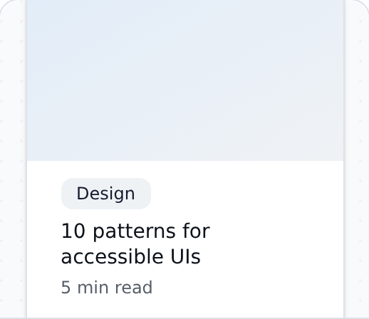
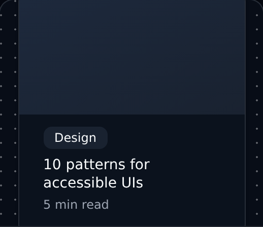
Blog article preview card showing cover image, title, excerpt, author, and publication metadata.
Hierarchy of links showing the current page's location within the broader site navigation tree.
Primary interactive control that triggers an action, submits a form, or navigates to another view.
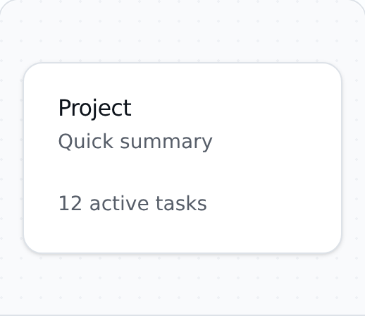
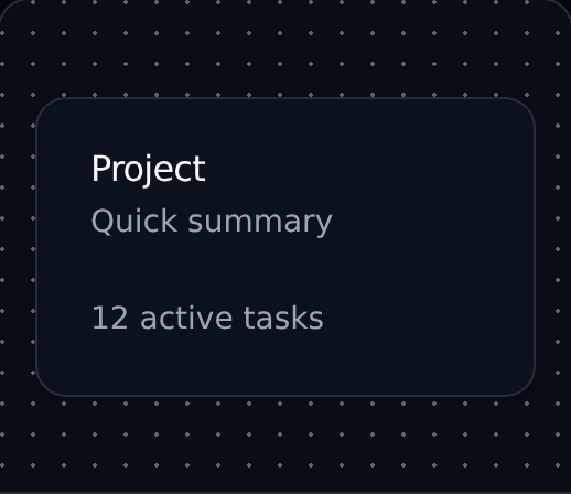
Surface that visually groups related content, metadata, and actions into a single contained block.
Horizontally sliding region of items with previous and next controls and keyboard navigation support.
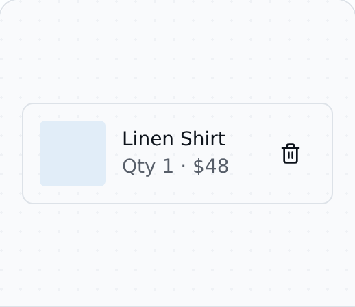
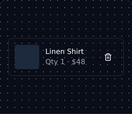
Single line item row in a shopping cart, showing thumbnail, title, quantity controls, and price.
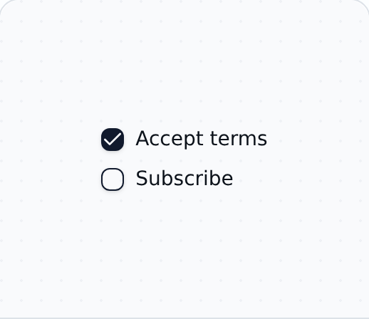
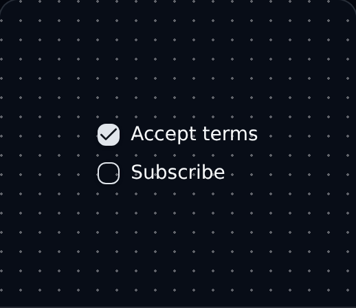
Binary input that can be checked, unchecked, or indeterminate.
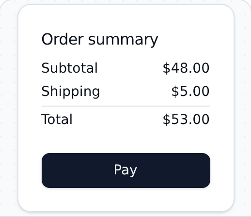
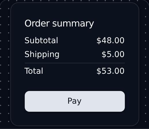
Order summary block displaying subtotal, taxes, discounts, and grand total before checkout payment.
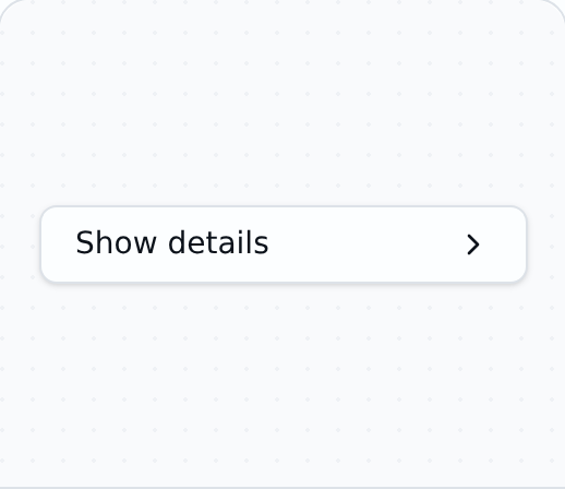
Expand and collapse a region of content to progressively disclose details without leaving the page.
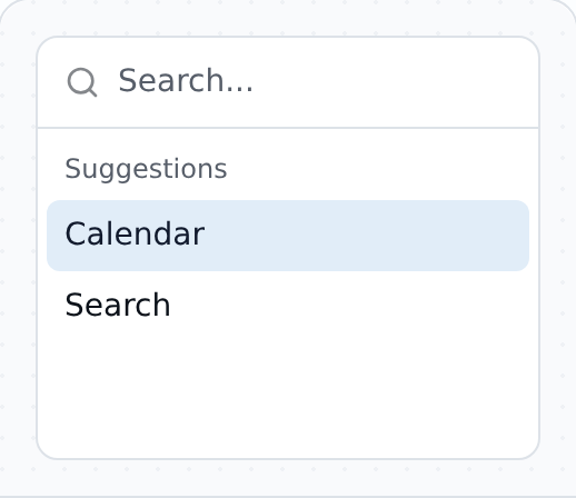
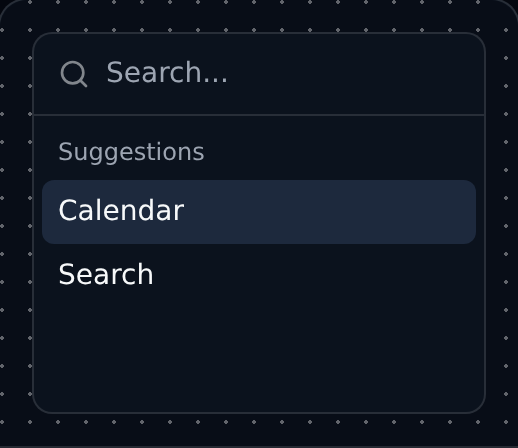
Fast, composable command menu and palette for searching actions, navigation targets, or content quickly.
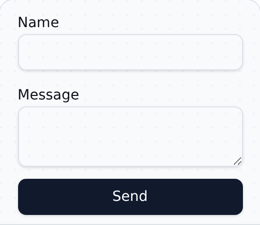
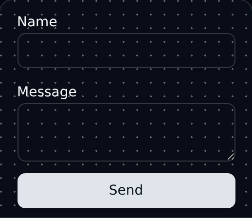
Contact form with name, email, and message fields for general inquiries and support requests.
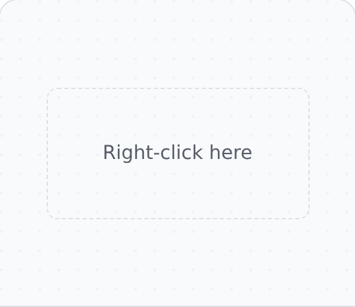
Contextual menu triggered by a right-click or long-press, surfacing actions tied to the targeted element.
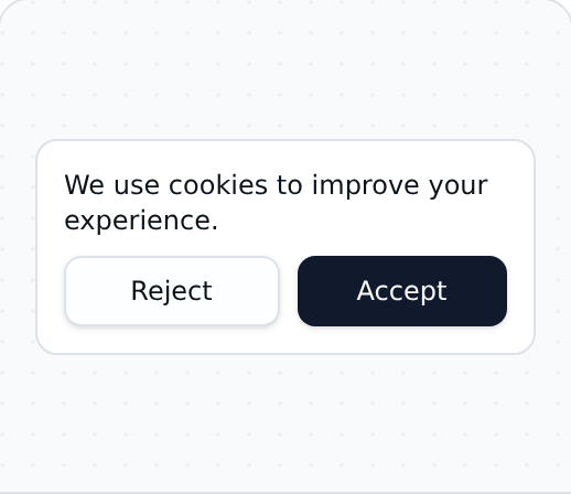
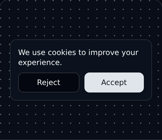
Cookie consent notice anchored to the page edge, with options to accept, reject, or customize choices.
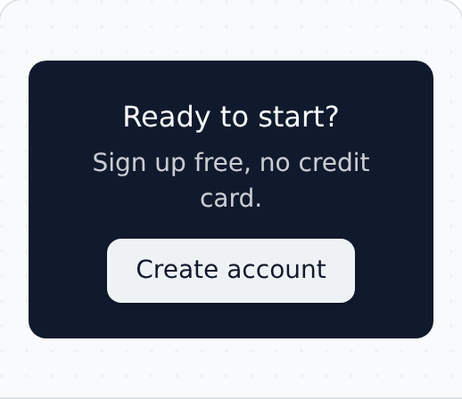
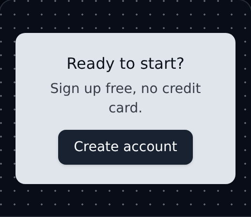
Wide call-to-action band placed before the footer to drive sign-ups, demos, or final conversions.
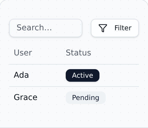
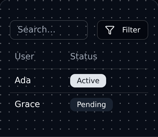
Sortable, filterable data table with row-level actions, suitable for admin and dashboard interfaces.
Modal dialog window overlaid on the page to focus attention on a single task or confirmation.
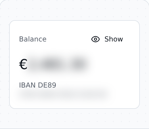
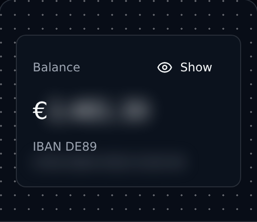
Masks sensitive values (e.g. amounts) with a CSS blur, with a toggle to reveal. Inspired by N26's discreet mode.
Edge-anchored sliding panel optimized for mobile-first flows like filters, settings, and quick actions.
Menu of contextual actions or links triggered by a button, with full keyboard and screen reader support.
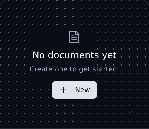
Friendly empty-state placeholder shown when a list or view has no data, with guidance and an action.
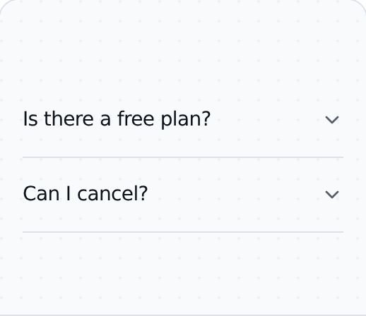
Frequently asked questions accordion section that lets visitors expand answers one at a time.
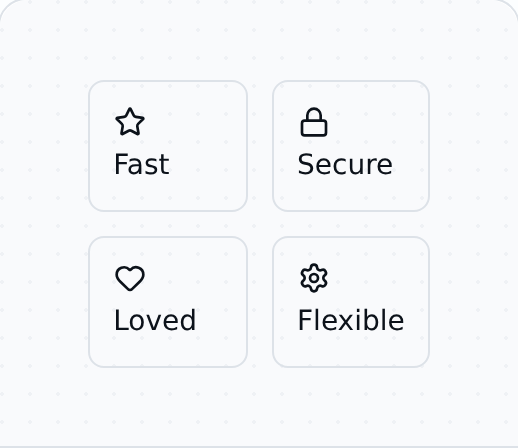
Responsive grid of product features paired with icons and short descriptions to highlight benefits.
Site footer with grouped link columns, copyright, and secondary navigation across multiple sections.
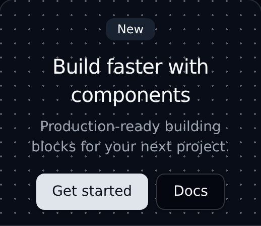
Above-the-fold marketing hero with a headline, supporting copy, and a primary call-to-action button.
Preview related content in a small floating card when the user hovers or focuses on a trigger.
Single-line text input field for collecting short responses such as names, emails, or search queries.
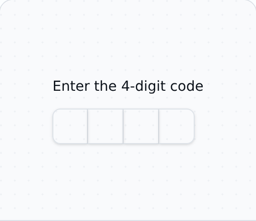
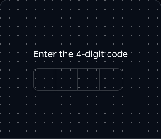
One-time-passcode input with per-digit slots, ideal for verification flows and two-factor authentication.
Accessible label associated with a form control to describe its purpose for sighted and screen reader users.
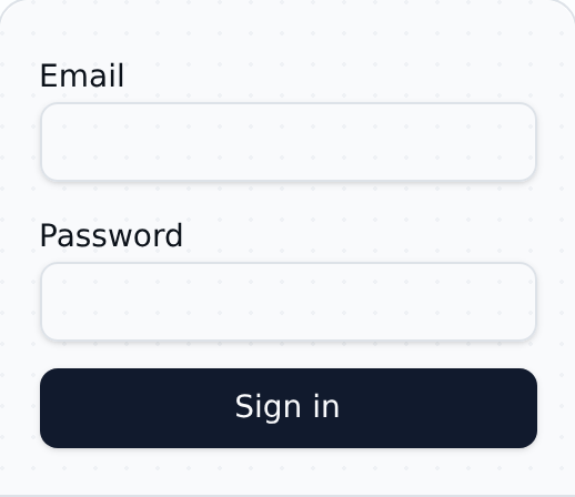
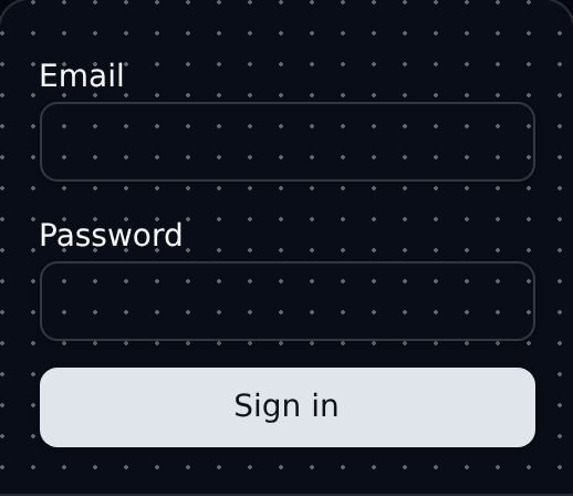
Standard sign-in form collecting email and password with validation, error states, and recovery links.
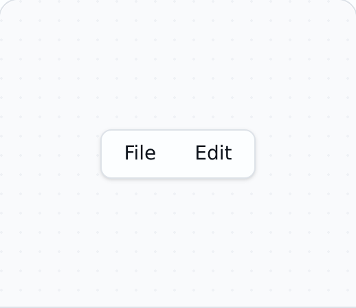
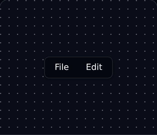
Persistent menu bar that exposes multiple grouped menus, similar to desktop application menu bars.
Stepper indicating progress through a multi-step form or wizard, with completed and active states.
Top-level site navigation menu with hover and focus disclosure of nested links and feature panels.
Inline email subscribe input for newsletter signups, with a submit button and inline confirmation state.
Success confirmation state shown after a completed purchase, including next steps and order details.
Confirm a one-time verification code sent by email or SMS as part of a secure two-factor flow.
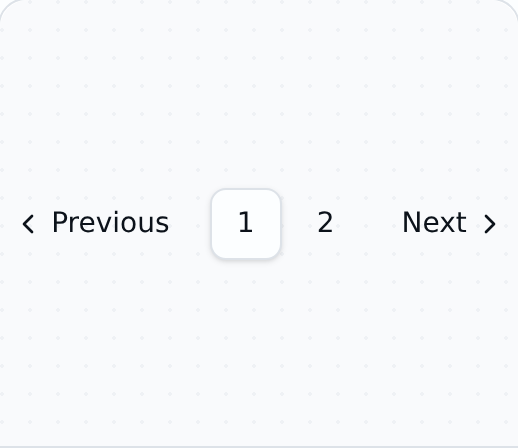
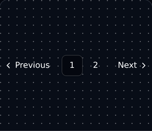
Pagination control for navigating between pages of a long content list, table, or search result set.
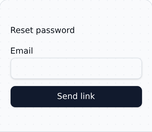
Password reset request form that asks for the account email and sends a secure recovery link.
Floating panel anchored to a trigger element, useful for showing extra controls or contextual content.
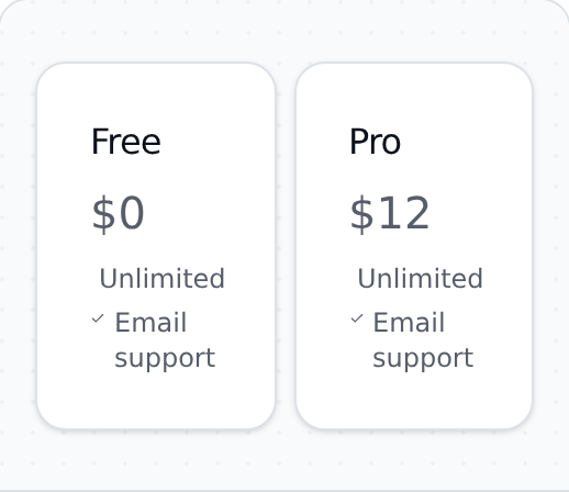
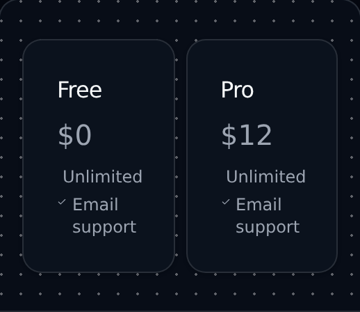
Tiered pricing plans displayed side by side with feature lists and a call-to-action for each plan.
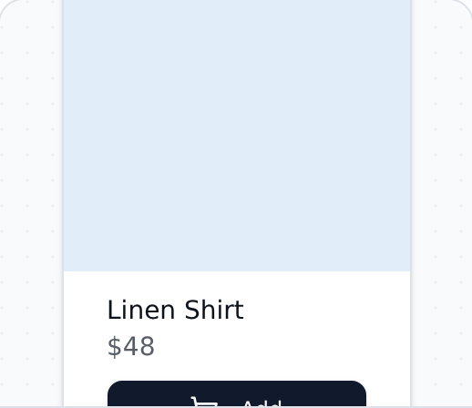
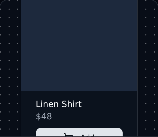
E-commerce product listing card showing image, title, price, and a primary call-to-action button.
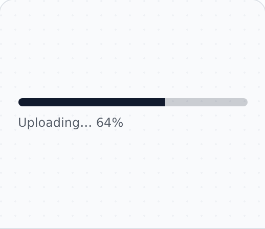
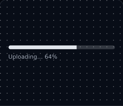
Visual indicator showing the completion progress of a task, upload, or multi-step background operation.
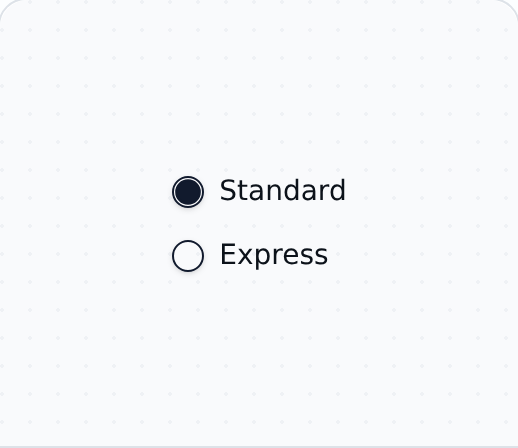
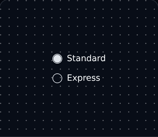
Group of mutually-exclusive radio options where only a single value can be selected at any time.
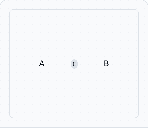
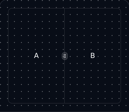
Resizable split panes that let users drag a divider to balance space between adjacent regions.
Styled, accessible scrollable region with custom scrollbars that work consistently across browsers.
Prominent search input with leading icon and clear button, suitable for global search experiences.
Dropdown menu for choosing a single value from a list of predefined options, with keyboard support.
Visual or semantic divider that separates content groups, often paired with section headings or lists.
Side-anchored modal panel that slides in from an edge for secondary content, navigation, or settings.
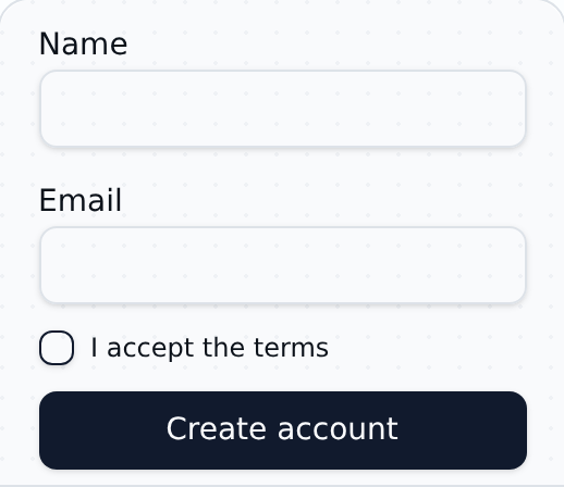
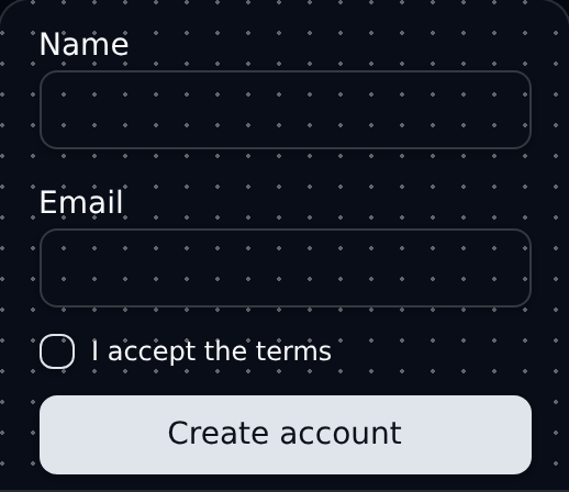
Account creation form with email, password, and explicit terms acceptance for new user registration.
Animated placeholder shown while content loads, preserving layout and reducing perceived wait time.
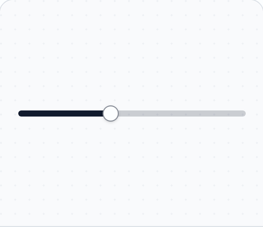
Numeric range input controlled by a draggable thumb, ideal for adjusting volume, price, or filters.
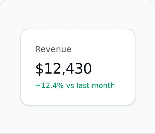
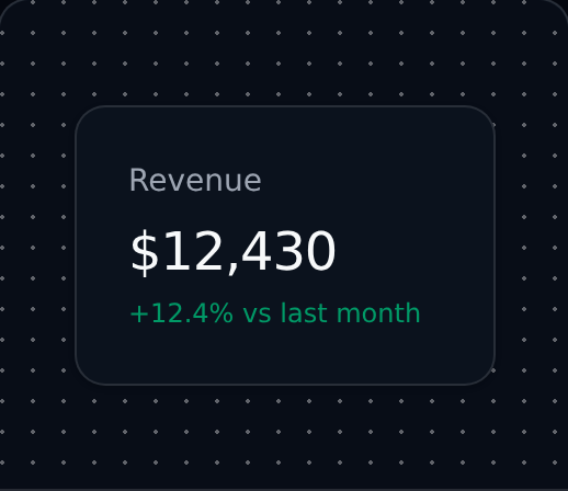
KPI tile for dashboards displaying a single metric with label, value, and optional trend indicator.
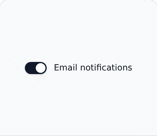
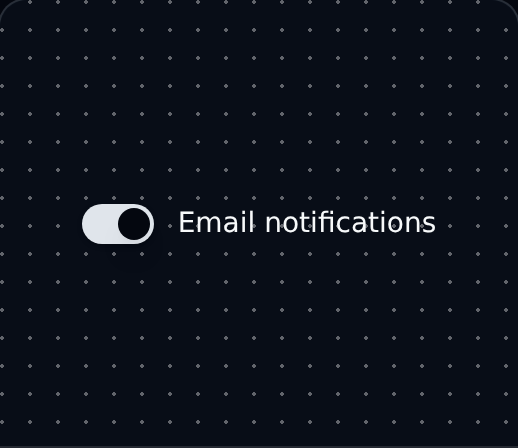
On/off switch for binary settings such as enabling notifications, dark mode, or feature flags.
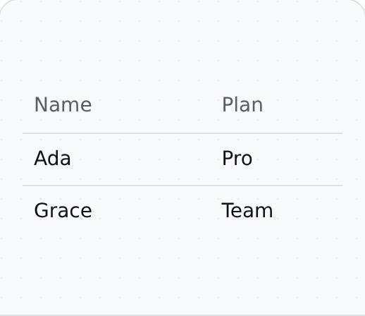
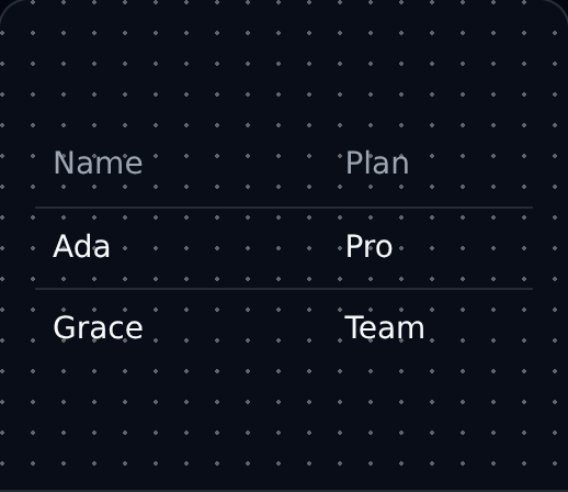
Tabular data layout with header, body, and rows for displaying structured records and data sets.
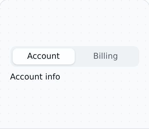
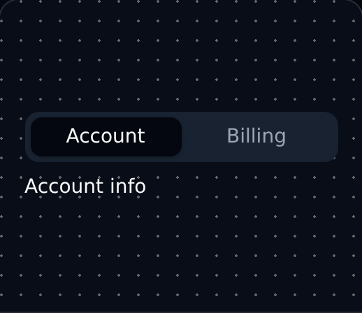
Tabbed interface for switching between related content panels in the same area without navigating away.
Customer testimonial quote paired with the author's name, role, and avatar for added social proof.
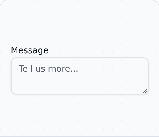
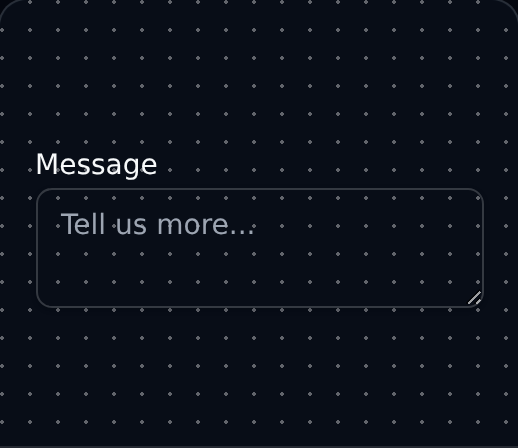
Multi-line text input area for longer responses such as comments, messages, or descriptive content.
Stacked, non-blocking toast notifications for surfacing transient feedback without interrupting the user.
Two-state button that visually reflects pressed and not-pressed states for binary, toolbar-style actions.
Group of toggle buttons supporting single or multi-select selection for filters and view options.
Brief contextual label shown on hover or focus to describe an icon button or compact control.